XHTML Forms
Web forms, much like the
analogous paper forms, allow the user to provide input. This input is typically
sent to a server for processing. Forms can be used to submit data (e.g.,
placing an order for a product) or retrieve data (e.g., using a search engine).
There are two parts to a form: the user interface, and a script to process the
input and ultimately do something meaningful with it. This document explains
how to create the form's user interface. The mechanics for processing form data
– specifically with PHP – will be covered later in the course.
Form syntax
A form has three main
components: the form element, form widgets (e.g., text boxes and menus),
and a submit button. The form element has two required attributes – method and action.
<form method="post" action="script.url">
...
</form>
All form elements, also known
as widgets, have a name attribute that uniquely identifies them. The data is
sent to the server as name-value pairs, where the name is the input element's
name and value is that input element's value. We will discuss later how this
value can be used by the script.
Submission method
The method attribute specifies how data should be sent to the
server. The get method encodes the form data into the URL. Suppose a
form has two input elements with the names name1 and name2 with respective values value1
and value2. The get method would send a
URL of the form script.url?name1=value1&name2=value2. The post method will
not include the form data encoded into the URL. The post method is considered more secure because the get method allows a hacker to bypass the form by calling
the script directly and passing an arbitrarily encoded URL string, which could
contain invalid values. NOTE: If
the form values contain non-ASCII characters or the form content of the URL
exceeds 100 characters, the post method must be used.
Submission action
The action attribute specifies the script that will process the
data. The value for this attribute is typically a CGI script or some other type
of Web-based script, such as a PHP script. The get
method is typically used when the script does not modify any state information
on the server side, such as when a database query is performed. The post method is typically used if the script does modify
any state information, such as making an update to a database.
Selection widgets
Selection widgets allow
a user to select one or more items from a constrained set of choices. Selection
widgets should always be preferred over text input widgets when the number of
constrained choices is a manageable number. If the number of constrained
choices is small enough so that they can all be visually displayed, such as a
person's gender, then radio buttons or check boxes should be used. If the
number of constrained choices is large enough that it is infeasible to display
them all, such as the states in the United States, then a menu is a good
choice.
Radio buttons
A radio button is a
form widget that allows the user to choose only one of a predefined set of items. When the user selects a
radio button, any previously selected radio button in the same group is
deselected. To create a radio button, use the input
element with radio as the type
attribute's value, specify a name using the name
attribute, and provide a value using the value
attribute. All radio buttons that have the same value for the name attribute are considered a group. The value provided
to the name attribute will be the name used in the name-value pair that gets
passed to the script. To make one of the radio buttons be the default
selection, set the checked attribute for that button to the value checked.
<p>Username: <input
type="text" name="uname" /></p>
<p>How would you rate your skill in
programming?<br />
<input type="radio" name="skill"
value="beg" />Beginner
<input type="radio" name="skill"
value="int" />Intermediate
<input type="radio" name="skill"
value="adv" />Advanced
<input type="radio" name="skill"
value="sup" />Super-hacker</p>
<p>How many hours do you spend
programming each week?<br />
<input type="radio" name="hours"
value="beg" />0-10<br />
<input type="radio" name="hours"
value="int" checked="checked"
/>11-20<br />
<input type="radio" name="hours"
value="adv" />21-30<br />
<input type="radio" name="hours"
value="sup" />30+</p>
This is how the markup may
appear in the browser.

Note that the labels
displayed next to the radio buttons are not the values of the value attributes. The value
attribute's content is what will be sent to the server; the label/description
is provided within the page text. Also note that the first group of radio
buttons does not have a radio button selected. To ensure that a selection is
made, use the checked attribute as shown in the example. If no radio button
in a group is selected, that group's name-value pair will not be sent to the
server, meaning that the input element will be undefined within the script that
processes the form data.
Checkboxes
A checkbox is a form
widget that allows the user to make multiple selections from a number of items. To create a checkbox,
use the input element, specify checkbox as
the type, specify a name using the name attribute, and provide a value using the value attribute. As with radio buttons, all checkboxes that
have the same value for the name attribute are
considered a group. You may pre-select one or more checkboxes using the checked attribute.
<p>Username: <input
type="text" name="username" /></p>
<p>What programming languages have you
used?<br />
<input type="checkbox"
name="proglang" value="c" />C
<input type="checkbox"
name="proglang" value="cplusplus" />C++
<input type="checkbox"
name="proglang" value="java" />Java
<input type="checkbox"
name="proglang" value="perl" />Perl
<input type="checkbox"
name="proglang" value="perl" />Python</p>
<p>I agree to...<br />
<input type="checkbox" name="cheaplabor"
value="yes" checked="checked"
/>work for $1.50/hour.<br />
<input type="checkbox" name="longdays"
value="yes" checked="checked"
/>work 12 hours per day.<br />
<input type="checkbox" name="late"
value="yes" />show up late
every day.<br />
<input type="checkbox" name="usecomments"
value="yes" checked="checked"
/>comment my code.<br /></p>
Here's how the markup may
appear in the browser.
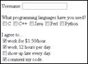
Suppose the checkboxes
corresponding to C, Java, and Perl were selected in the above example.
Three name-value pairs would be sent to the server: proglang=c, proglang=java, and proglang=perl.
Menus
A menu is a form
widget that allows the user to select one (or possibly multiple) of several
predefined values. Menus are useful in situations where displaying all of the
values hinders page readability. Suppose you want the user to select their
state of residence. One method is to make numerous radio buttons; the
alternative is to use a menu.
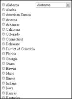
The example output on the
left demonstrates how the menu hides all but the first choice, whereas all of
the choices are displayed when using radio buttons. The example output on the
right shows the expansion of the menu widget and the addition of scroll bars to
further minimize the real estate occupied by the menu items.
To create a menu, use the select element to specify a name using the name attribute. The two optional attributes size and multiple control the
display and functionality of the menu respectively. The size attribute specifies the desired height (in lines) of
the menu. The multiple attribute allows the user to select more than one
menu option (usually with the Control key for PCs and Command key for
Macintoshes). The menu items themselves are created using the option element, which has a required value attribute. The text for the menu item is specified
between the start- and end-tags for the option
element. To have a menu item selected by default, use the selected attribute.
<select name="state">
<option
value="al">Alabama</option>
<option value="ak">Alaska</option>
<option value="as">American Samoa</option>
<option value="az">Arizona</option>
<option value="ar">Arkansas</option>
<option value="ca">California</option>
...
</select>
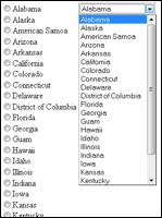
The following markup
demonstrates the size and multiple attributes of the
select element as well as the selected
attribute for the option element.
<select name="state" size="5" multiple="multiple">
<option
value="al">Alabama</option>
<option value="ak">Alaska</option>
<option value="as">American Samoa</option>
<option value="az">Arizona</option>
<option value="ar">Arkansas</option>
<option value="ca" selected="selected">California</option>
...
</select>
Here is how the markup may
appear in the browser. The example output on the left shows a menu with five
options displayed simultaneously, with California already selected as the
default choice. The example output on the right shows a menu with multiple
(non-contiguous) choices selected.


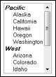
Most Web browsers support
grouping menu items into categories. To create a group menu, use the optgroup element, specifying the name of the category with the
label attribute. Next, make the desired menu choices (option elements) children of the optgroup element.
<select name="state"
size="10">
<optgroup label="Pacific">
<option
value="ak">Alaska</option>
<option
value="ca">California</option>
<option
value="hi">Hawaii</option>
<option
value="or">Oregon</option>
<option
value="wa">Washington</option>
</optgroup>
<optgroup label="West">
<option
value="az">Arizona</option>
<option
value="co">Colorado</option>
</select>
Here is how the output may
appear in the browser.
Text input widgets
Text input widgets are used
to input one or more strings of text. They can have either a specialized
purpose, such as submitting a password, or a generic purpose, such as entering
a free-form line of text.
Text boxes
Text boxes contain one
line of free-form text, and are typically used when the input is not derived
from a constrained set of values. For example, text boxes are good choices for
names or addresses, because it is impossible to predict in advance the name or
address that will be entered by a user. To create a text box, use the input element, specify text as the type attribute's value, and name the text box using the name attribute.
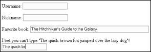
<p>Username: <input
type="text" name="username" /></p>
<p>Nickname: <input
type="text" name="nickname" /></p>
This is how the markup may
appear in the browser.
Three optional elements
control how the text box appears. The value
attribute specifies the default text that should be shown when the text box is
displayed. This text will be sent to the server if the user does not modify it.
The size attribute specifies the width of the text box
measured in characters. The maxlength attribute
specifies the maximum number of characters that can be entered in the text box.
<p>Username: <input
type="text" name="username" /></p>
<p>Nickname: <input
type="text" name="nickname" /></p>
<p>Favorite book: <input
type="text" name="favbook" size="60"
value="The Hitchhiker's Guide to the Galaxy"
/></p>
<p>I bet you can't type "The
quick brown fox jumped over the lazy dog"!<br />
<input type="text"
name="pangram" maxlength="12"
/></p>
This is how the markup may
appear in the browser. NOTE: The
text in the last text box was entered to demonstrate that no more than twelve
characters could be entered.
A few things to note about
text boxes:
- The default width is twenty characters (e.g., size="20").
- The default value for a text box is the empty
string (e.g., value=""). Unlike a radio button that sends nothing to
the server if it is not selected, the text box will send the empty string
to the server.
Password boxes
Password boxes can be
used to visually mask confidential data, such as passwords, from casual
observers. Password boxes are identical to text boxes, except that whatever is
typed into a password box is masked by bullets or asterisks. To create a
password box, use the input element, specify password as
the type attribute's value, and name the password box using
the name attribute.
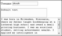
<p>Username: <input
type="text" name="uname" /></p>
<p>Password: <input type="password"
name="passwd" /></p>
Here is how the markup may be
displayed in the browser.
As with text boxes, password
boxes also support the size, maxlength, and value attributes; however, having a predefined value for a
password box defeats the purpose of having a password at all. It is also
important to note that password boxes do not provide any encryption, so it is
possible for the password to be intercepted when the form data is sent to the
server unless a secure connection is used (i.e., HTTPS). The primary purpose of
the password box is to visually protect the text string.
Text areas
Text areas allow the
user to provide more than one line of textual input. Text areas can be as wide
as the page itself, and the browser will add scroll bars if the text provided
by the user exceeds the size of the text area. To create a text area, use the textarea element, specify the number of rows and columns using
the rows and cols attributes, and name the
text area using the name attribute. Default text can be specified by placing
it between the textarea begin- and end-tags.
<p>Username: <input
type="text" name="username" /></p>
<textarea
name="comments" rows="2" cols="30">Default
text</textarea>
<textarea
name="comments" rows="5"
cols="40"></textarea>
This is how the markup may
appear in the browser. NOTE: The
text in the text area was added to demonstrate that scroll bars are added if
the input text exceeds the size of the text area.
Hidden fields
A hidden field is a
form component that allows name/value pairs to be specified without any visual
representation. The hidden name/value pairs will be sent to the server for
processing just like the pairs corresponding to the other form widgets. To
create a hidden field, use the input element, specify hidden as the type
attribute's value, and provide values for both the name and value attributes.
<input type="hidden"
name="pageid" value="x3g9kf43" />
Hidden fields can be
specified anywhere within the form start- and end-tags.
Hidden fields are useful for
providing context. For example, suppose you have (1) a Web page with a form
that facilitates removing records from a database, and (2) a script to process
the name/value pairs and perform the deletion. Instead of simply assuming the
user's choice of records to delete is correct, a confirmation page should be
displayed prompting the user to confirm the deletion. The processing script can
be set up so that it looks for a specific name/value pair – for example, confirmdelete="yes". If the form is lacking this pair, the script can
generate the XHTML, which includes the hidden field <input
name="confirmdelete" value="yes" />, for the confirmation page. When the user submits the
form data from the confirmation page, the confirm deletion pair will exist,
meaning that the record deletion should take place.
Submitting and resetting forms
Form data is submitted to the
server when the user clicks on a submit button widget. NOTE: There are other methods for submitting form data
without using a button widget; however, they are beyond the scope of this
document. To create a submit button, use the input
element, specify submit as the type
attribute's value, and provide a label for the button widget via the value attribute.
<input type="submit"
value="Let's Go!" />
This is how the markup may appear in the browser.
The name attribute is
optional for the submit button. Suppose you have a Web page with two separate
forms corresponding to creating an account and signing in using an existing
account. The first form might have fields for address information, desired
username, and password. The second form will likely only have two text boxes:
username and password. The first form's submit button may be marked up as <input
type="submit" name="newacct" value="Create
Account" />. The second form's
submit button may be marked up as <input type="submit"
name="signin" value="Sign In" />. The script on the server can simply check for the
existence of newacct or signin to determine the
next course of action.
A typical companion to the
submit button widget is the reset button widget, which resets a form to
its original state (i.e., default values). To create a reset button, use the input element, specify reset as the type attribute's value, and provide a label for the button
widget via the value attribute.
<input type="reset"
value="Start Over" />
This is how the markup may appear in the browser.
To create a submit or reset
button with an image, use the button element with an img child element. The type, name, and value attributes for the
button element should either be submit or reset depending on the desired action.
<button
type="submit" name="submit" value="submit">
<img src="letsgo.gif" alt="Submit form data"
/>
</button>
This is how the markup may
appear in the browser.
Organizing form content
Legends
Things.
Labels
Things.
Tab order
Things.
Keyboard shortcuts
Things.
Protecting form content
Disabling elements
Things.
Read-only elements
Things.