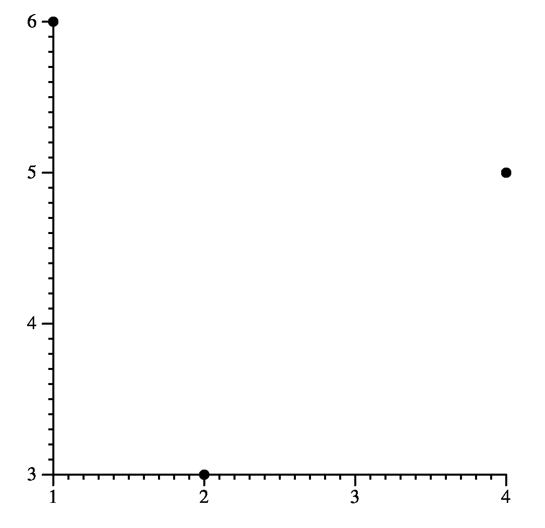
(* Simple jgraph *) newgraph newcurve pts 2 3 4 5 1 6 |
 |
You run jgraph with
jgraph [-PL] [input-file] |
If you don't specify a file, it will read from standard input. It will emit encapsulated PostScript on standard output. If you specify -P, then it will emit non-encapsulated PostScript that can go to a printer. If you want to get PDF from a jgraph, typically use the -P option and then pipe the output to "ps2pdf -". If you then want JPEG, pipe that to convert - output.jpg.
The complete reference for jgraph is its man page. The nroff is in ~plank/src/jgraph/jgraph.1. There's a nice man page online at https://manpages.debian.org/jessie/jgraph/jgraph.1.en.html.
UNIX> jgraph -P simp1.jgr | ps2pdf - | convert -density 300 - -quality 100 simp1.jpgHere is the jgraph and the JPEG (which I cropped manually):
(* Simple jgraph *) newgraph newcurve pts 2 3 4 5 1 6 |
|
What this has done is draw a simple graph with three points: (2,3), (4,5) and (1,6). Jgraph added axes and chose how to plot the points. It's not very pretty, but it's a start.
Next, take a look at simp2.jgr and its output:
newgraph
xaxis size 2
yaxis size 1.5

newcurve pts 0 6  1 9  2 11  3 14  4 18 5 20
newcurve marktype triangle linetype solid
         pts 0 3  1 4  2 7  3 9  4 10 5 13
newcurve marktype none linetype dashed color 1 0 0
         pts 0 0  1 2  2 3  3 5  4 6  5 9
|
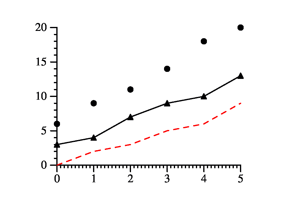 |
The second two lines set the sizes of the x and y axes to 2 inches and 1.5 inches repectively (the JPG in the drawing blows it up - if you simply look at the PDF, it will be the correct size).
We then plot three curves: The first curve lets jgraph choose the drawing style. The second plots the points with triangles, and connects them with a solid line. The third does not plot the points, but just the line connecting them. The line is dashed, and its color will be red (colors are specified as rgb values where 1 is full saturation, so "1 0 0" is all red, no green and no blue). You'll note that the axes have been made big enough to hold all of the points. That is the default behavior.
The valid marktypes and linetypes are defined in the man page. You may use newline instead of ``newcurve marktype none linetype solid''
There are some exceptions to this. For example, whenever you say pts, you are adding points to the current curve. Therefore
newcurve pts 0 0 1 1 2 2and
newcurve pts 0 0 pts 1 1 pts 2 2are equivalent.
You may include files most anywhere in your jgraph input by saying ``include filename.''
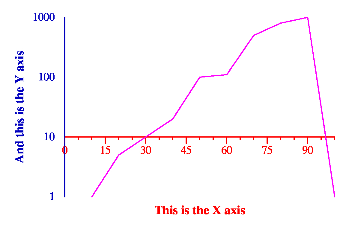
newgraph

xaxis
  min 0 max 100
  hash 15
  mhash 2 (* i.e. minor hashes at the 5's and 10's *)
  color 1 0 0
  label : This is the X axis
  draw_at 10

yaxis
  min 1 max 1000
  size 2
  log
  no_draw_hash_marks
  label : And this is the Y axis
  color 0 0 .75

newline color 1 0 1
  pts 10 1
      20 5
      30 10
      40 20
      50 100
      60 110
      70 500
      80 800
      90 1000
      100 1
|
 |
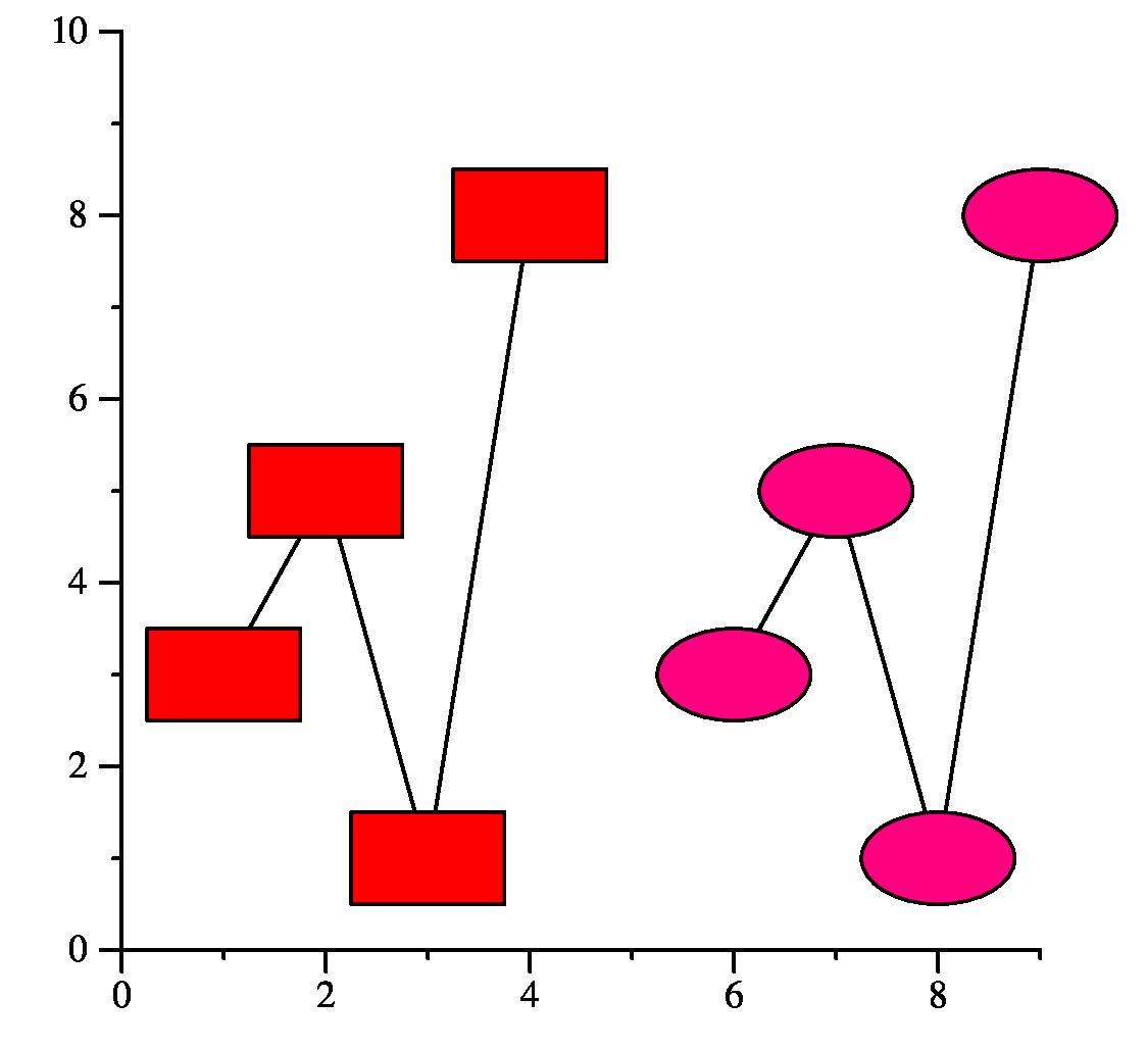
You may say copycurve to create a curve with the same attributes as the previous curve (but not the same points).
Below, curve.jgr shows an example. Note that cfill fills the inside of a mark with the specified color. You can change all of the mark's color with color, and you can use fill to specify grayscale. You can specify none as a fill value, and the mark will be empty (transparent).
newgraph

xaxis min 0 max 9
yaxis min 0 max 10

newcurve marktype box marksize 1.5 1
         linetype solid cfill 1 0 0
   pts 1 3  2 5  3 1  4 8

copycurve marktype ellipse cfill 1 0 .5
   pts 6 3  7 5  8 1  9 8
|
 |
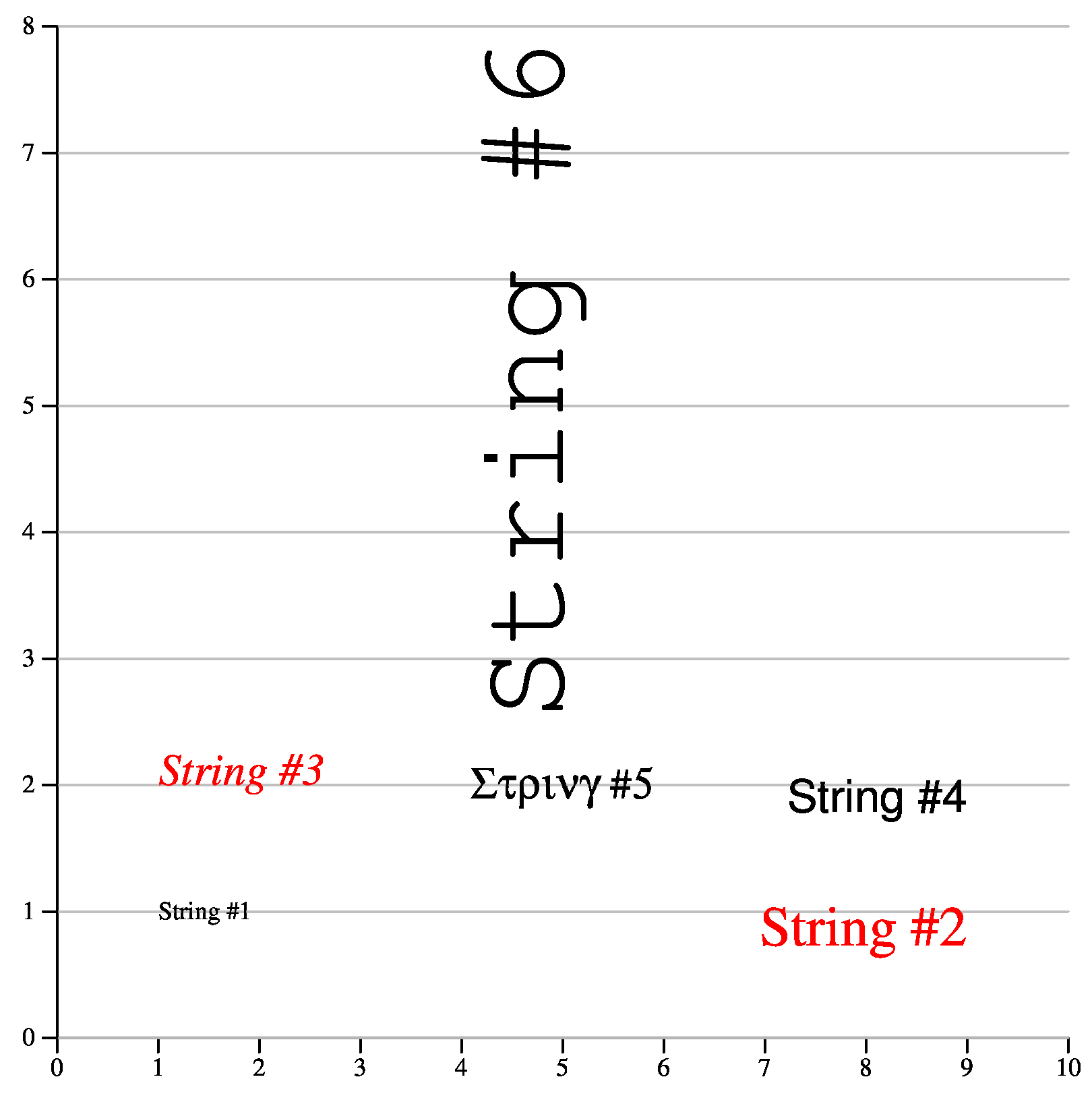
The color is specified with lcolor (lgray lets you specify greyscale). Justifications are specified as follows:
Graph labels are strings too and can make use of the above attributes.
Copystring copies all attributes of a string (including the text).
newgraph
  xaxis min 0 max 10 hash 1 mhash 0 size 5
  yaxis min 0 max 8 hash 1 mhash 0 size 5
        grid_lines grid_gray .7

newstring hjl vjc x 1 y 1 : String #1

newstring hjr vjt x 9 y 1
          fontsize 20 lcolor 1 0 0 : String #2

copystring hjl vjb x 1 y 2
          fontsize 16 font Times-Italic : String #3

newstring hjr vjt x 9 y 2
          fontsize 16 font Helvetica : String #4

newstring hjc vjc x 5 y 2
          fontsize 16 font Symbol : String #5

newstring hjl vjb fontsize 45
          font Courier rotate 90 x 5 y 2.5 : String #6
|
 |
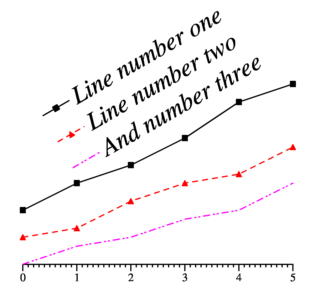
newgraph
xaxis min 0 max 5
yaxis min 0 size 2 nodraw

newcurve marktype box linetype solid label : Line number one
   pts 0 6  1 9  2 11  3 14  4 18 5 20
newcurve marktype triangle linetype dashed color 1 0 0 label : Line number two
   pts 0 3  1 4  2 7  3 9  4 10 5 13
newcurve marktype none linetype dotdotdash color 1 0 1 label : And number three
         pts 0 0  1 2  2 3  3 5  4 6  5 9
|
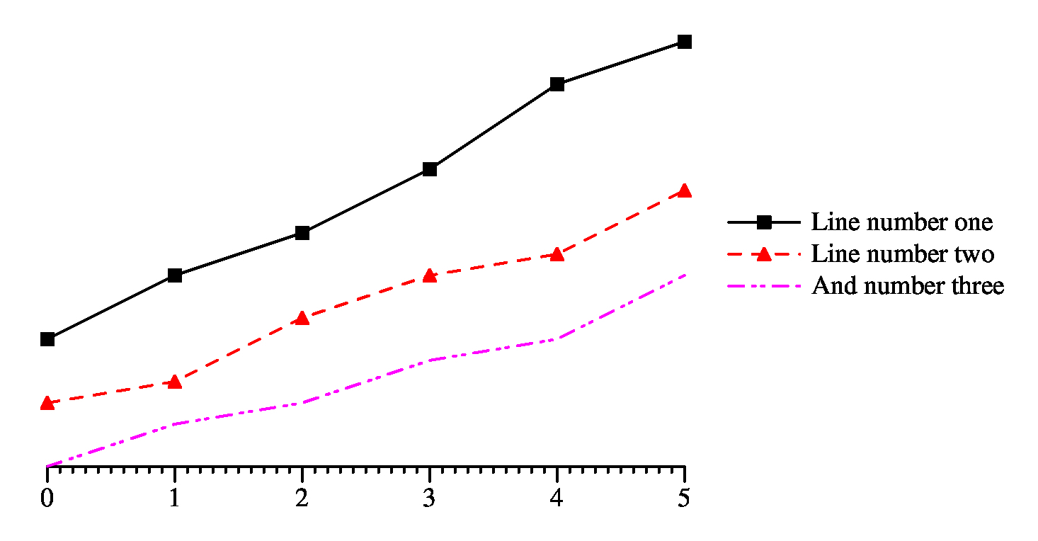 |
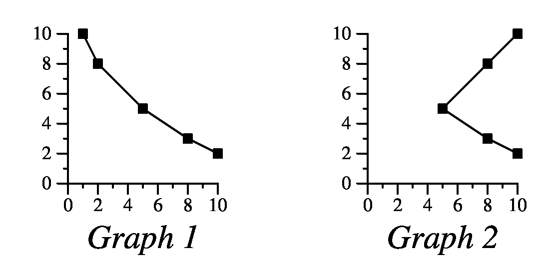
You can change the font and location of the legend as a unit by saying ``legend defaults'' and then specifying string attributes. This will modify all of the legend strings. See legend2.jgr for an example. Try modifying it and see what happens. There are other cool things you can do with the legend -- see the man page.
newgraph
xaxis min 0 max 5
yaxis min 0 size 2 nodraw

newcurve marktype box linetype solid label : Line number one
   pts 0 6  1 9  2 11  3 14  4 18 5 20
newcurve marktype triangle linetype dashed color 1 0 0 label : Line number two
   pts 0 3  1 4  2 7  3 9  4 10 5 13
newcurve marktype none linetype dotdotdash color 1 0 1 label : And number three
         pts 0 0  1 2  2 3  3 5  4 6  5 9

legend defaults font Times-Italic fontsize 20 rotate 30 hjl vjt x 6 y 0
|
 |
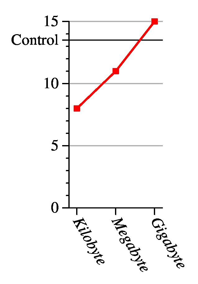
newgraph

(* Set up the x axis to have three points.
   Give it a little extra room to the right and left.
   The shash says to line up the hash marks so that
   if zero were on the axis, there would be a hash
   mark at zero. *)

xaxis size 1 min .8 max 3.2 hash 1 mhash 0 shash 0

    (* Don't produce hash labels automatically, but
       instead put three custom labels at hash marks
       1, 2 and 3. *)
    no_auto_hash_labels
    hash_label at 1 : Kilobyte
    hash_label at 2 : Megabyte
    hash_label at 3 : Gigabyte

    (* This sets the font and font size of the labels, it also
       says to left/center justify them and rotate them down
       60 degrees. *)

    hash_labels fontsize 12 font Times-Italic hjl vjc rotate -60

(* The y axis is more standard. *)

yaxis size 2 min 0 max 15 hash 5 mhash 4

  (* However, we're adding a labeled hash mark at 13.5 *)

  hash_at 13.5 hash_label at 13.5 : Control

  hash_labels fontsize 12    (* And we're setting the font size to 12 *)
  grid_lines grid_gray .7    (* And drawing grid lines at a grey level of 0.7 *)

(* Draw a reference line at y=13.5 through the whole graph *)

newline pts 0.8 13.5 3.2 13.5

(*This is a bad part of jgraph -- when you draw the gray grid lines, it
   makes the x axis gray.  I'm drawing this line to make it black again. *)

newline pts 0.8 0 3.2 0

(* And draw a red curve with red boxes and a doubly thick line *)

newcurve marktype box color 1 0 0
         linetype solid color 1 0 0
         linethickness 2
   pts 1 8  2 11  3 15
|
 |
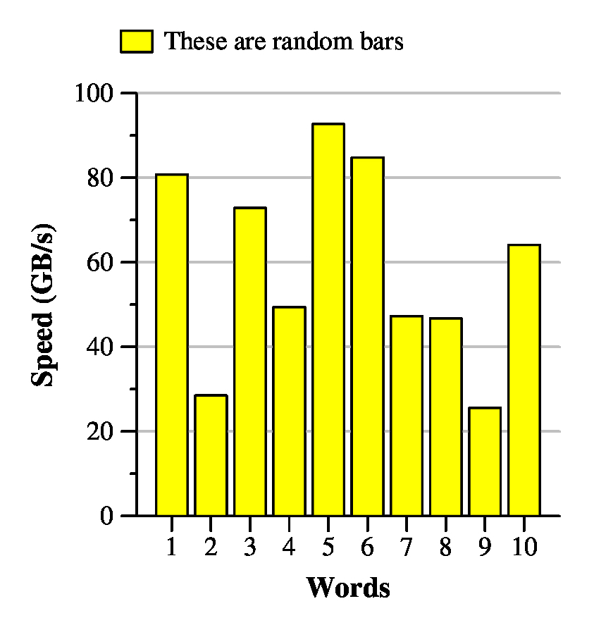
The file bar.jgr shows a straightforward example.
newgraph

(* Set up the x axis to have some
   extra room to the right and left. *)

xaxis size 2
  min 0.1 max 10.9 hash 1 mhash 0 shash 0
  label : Words

(* Nothing exciting here about the x axis *)

yaxis min 0 max 100 size 2
  label : Speed (GB/s)
  grid_lines grid_gray .7

(* Put the legend at the top *)

legend top

(* Unfortunately, if you don't do this, the
   x axis will be gray. *)

newline pts 0.1 0 10.9 0

(* The bars are filled with yellow *)

newcurve marktype xbar cfill 1 1 0

  (* The mark size says a width of 0.8,
     and in the legend, it has a height of
     five.  The units are the units of the
     x and y axes. *)

  marksize .8 5

  label : These are random bars
  pts
   1 80.7677 2 28.498 3 72.8278
   4 49.3617 5 92.705 6 84.8035
   7 47.2454 8 46.721 9 25.5328 10 64.1393
|
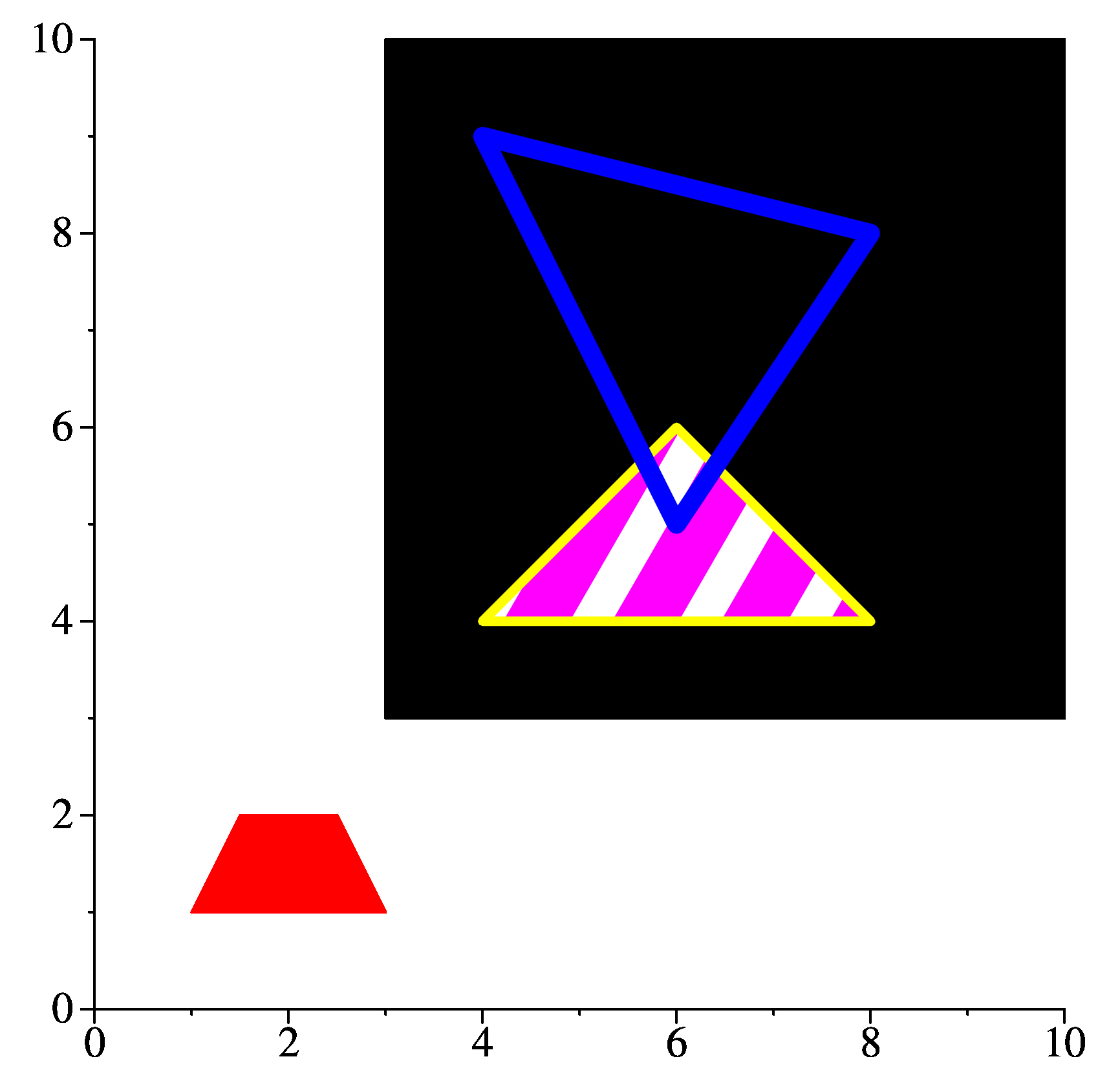
Poly.jgr shows an example of some polygons with different fillings. Note that jgraph draws curves in the order specified, so that you know how the overlapping will occur. Take a look at the output.
newgraph xaxis min 0 max 10 size 5 hash_labels fontsize 16 yaxis min 0 max 10 size 5 hash_labels fontsize 16 (* Draw a red trapezoid -- setting both the fill and color to be red means that the entire trapezoid, and not just the interior, will be red. *) newline poly pcfill 1 0 0 color 1 0 0 pts 1 1 3 1 2.5 2 1.5 2 (* Draw a big black square *) newline poly pfill 0 pts 3 3 10 3 10 10 3 10 (* Draw a thick yellow triangle with a purple, striped interior inside the black square *) newline poly linethickness 5 color 1 1 0 pcfill 1 0 1 ppattern stripe 60 pts 4 4 8 4 6 6 (* Draw a blue triangle with a thick border no fill *) newline poly linethickness 10 color 0 0 1 pfill -1 pts 4 9 6 5 8 8 |
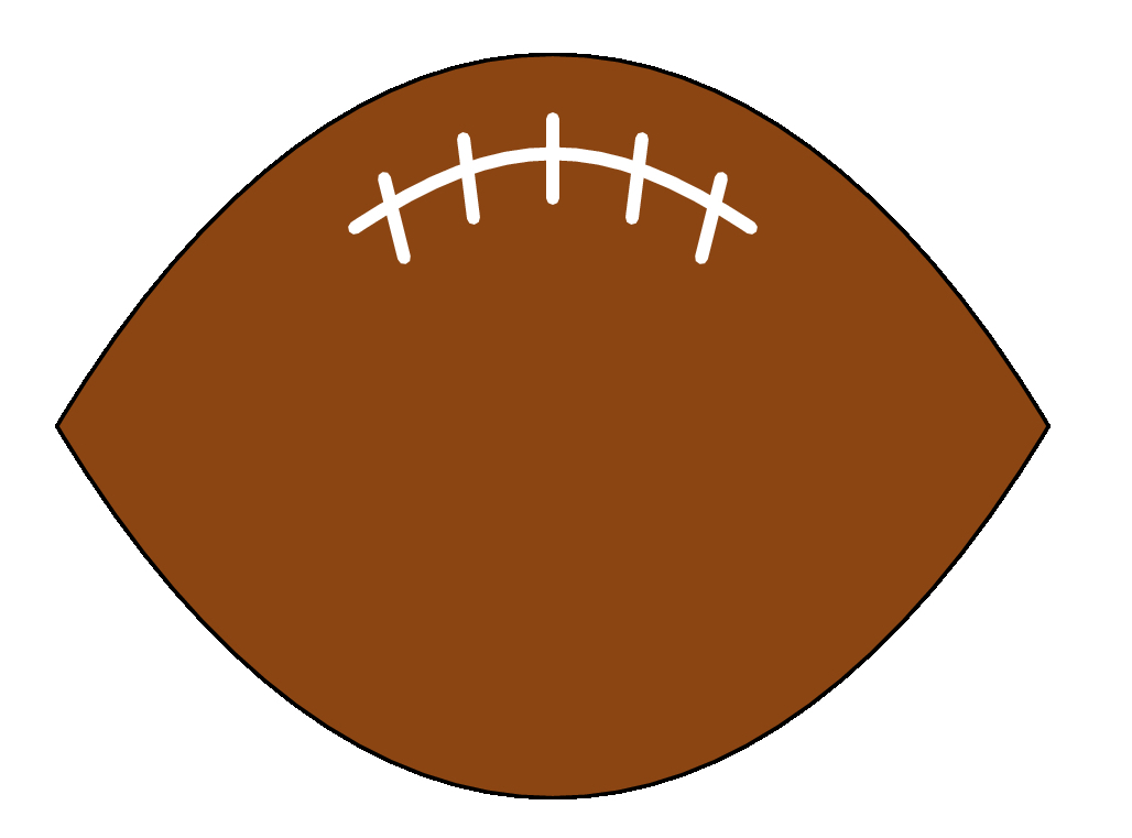
With jgraph you can use 3n+1 points to draw n connected bezier curves. The file football.jgr shows an example of drawing a low budget football using bezier curves in jgraph: I emphasize "low budget," but it works.
newgraph
xaxis min 0 max 10 nodraw
yaxis min 0 max 10 nodraw

(* Draw the outline of the football *)

newline bezier poly pcfill .543 .270 .074 pts
  0 5   3 10   7 10    10 5
        7 0    3 0     0 5

(* Draw the main thread *)

newline bezier linethickness 4 gray 1 pts
  3 7 4.5 8 5.5 8 7 7

(* Draw the crossthreads *)

copycurve nobezier pts 3.5 6.7 3.3 7.5
copycurve pts 6.5 6.7 6.7 7.5
copycurve pts 4.2 7.1 4.1 7.9
copycurve pts 5.8 7.1 5.9 7.9
copycurve pts 5 7.3  5 8.1
|
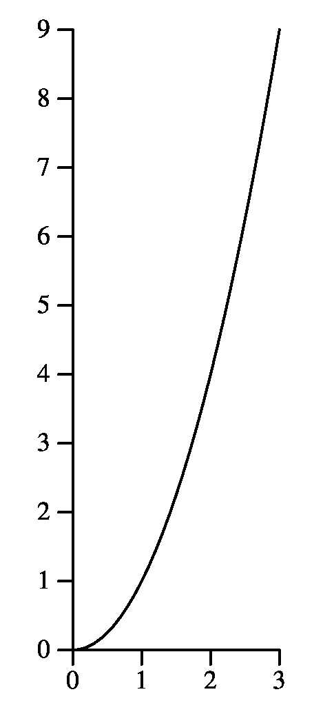
shell : commandThis is a very powerful feature, becuase it lets you use shell scripts and scripting languages like awk to do function plotting, data extraction, etc.
For example, suppose you want to see what an n-squared curve looks like. Don't use some stupid Python script -- use Jgraph and Awk (in shell.jgr):
newgraph
xaxis min 0 max 3 hash 1 mhash 0 size 1
yaxis min 0 max 9 size 3 hash 1 mhash 0

newline pts
  shell : echo "" | awk '{ for (i = 0; i <= 3.05; i += .1) print i, i*i }'
|
For multi-line shell scripts (or labels, for that matter), simply put a backslash at the end of the line. Sometimes you'll have to put a semi-colon at the end of the line too, because it passes the backslash to the shell process.
Below, I have a typical usage of jgraph and the shell to do data extraction. This comes from the Floyd-Warshall lecture notes. I have all of my program timings in the file ap-timings.txt. Here are the first seven lines:
FW 64 4096 0.005 DIJKSTRA 64 4096 0.009 SIMD 64 4096 0.003 FW 128 16384 0.012 DIJKSTRA 128 16384 0.028 SIMD 128 16384 0.003 FW 192 36864 0.032 |
The format of the file is:
Label number-of-nodes elements-in-adjacency-matrix time-in-seconds |
Below is the jgraph file that plots nodes vs time (in Floyd.jgr):
(* Nothing fancy with any of the axes.
   I probably should specify a max for
   the y-axis, but the graph looks fine
   without it. *)

newgraph
xaxis min 0 max 960 size 7
  hash 160
  hash_labels fontsize 14
  label fontsize 18 : Nodes

yaxis min 0 size 5
  hash_labels fontsize 14
  label fontsize 18 : Time (seconds)

(* Put the legend into the upper-left hand
   corner of the graph *)

legend defaults hjl vjt x 25 y 3.00 fontsize 14

(* For each of the three curves, grab the data from
   the file ap-timings.txt.  The x values are the
   second words on each line, and the y values are
   the last words.  Each line is labeled on its first
   word, and I use grep to isolate lines with the
   labels that I want. *)

newline marktype circle color 0 0 0
pts
  shell : grep FW ap-timings.txt | awk '{ print $2, $NF }'
  label : Floyd-Warshall, the original implementation

newline marktype circle color 1 0 0
pts
  shell : grep DIJKSTRA ap-timings.txt | awk '{ print $2, $NF }'
  label : Dijsktra

newline marktype circle color .5 0 .5
pts
  shell : grep SIMD ap-timings.txt | awk '{ print $2, $NF }'
  label : Floyd-Warshall - SIMD
|
 |
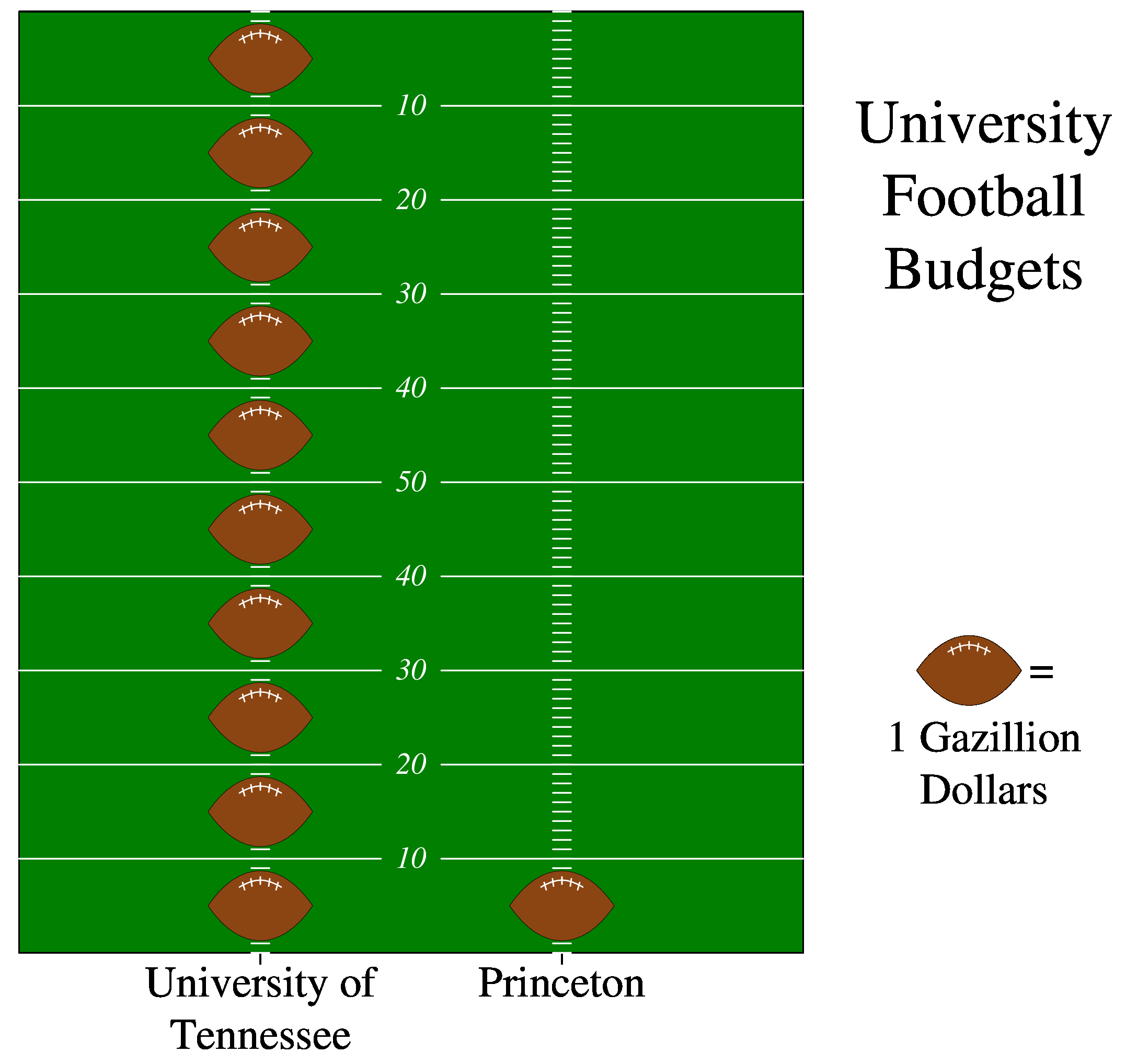
UNIX> jgraph football.jgr > football.epsNow, we'll draw a USA Today style graph. It's in fbf.jgr -- read the comments for explanation. You'll note that there are multiline labels, and multiline shell scripts in the file:
newgraph

(* Set up a "graph" to be a football field.
   There will be two points on the X axis, one
   for the University of Tennessee, and one
   for Princeton. That's why we use
   no_auto_hash_labels *)

xaxis
  min .2 max 2.8 size 5
  no_auto_hash_labels mhash 0 hash 1 shash 1

(* The Y axis has no labels. *)

yaxis
  min 0 max 10 size 6
  nodraw

(* Draw the football field.as one big green mark. *)

newcurve marktype box marksize 2.6 10 cfill 0 .5 0 pts 1.5 5

(* Draw 10-yard lines as two lines with a gap in the middle for
   the yard number. *)

shell : echo "" | awk '{ \
          for (i = 1; i < 10; i += 1) { \
             printf ("newline gray 1 pts 0.2 %d 1.4 %d\n", i, i); \
             printf ("newline gray 1 pts 1.6 %d 2.8 %d\n", i, i); \
          } }'

(* Draw 10-yard labels.  I do this by specifying a string which I
   never draw, and then copying it. *)

newstring hjc vjc font Times-Italic lgray 1 fontsize 14 x 1.5

shell : echo "" | awk '{ \
          for (i = 1; i < 6; i += 1) { \
             printf "copystring y %d : %d0\n",i, i \
          } }'

shell : echo "" | awk '{ \
          for (i = 6; i < 10; i += 1) { \
             printf "copystring y %d : %d0\n",i, 10-i \
          } }'

(* Draw 1-yard marks *)

shell : echo "" | awk '{ \
          for (i = 0; i < 10; i += .1) { \
             printf "newline gray 1 pts 0.97 %f 1.03 %f\n", i, i; \
             printf "newline gray 1 pts 1.97 %f 2.03 %f\n", i, i; \
          } }'

(* Now, draw footballs *)

newcurve eps football.eps marksize .35 1 pts
  shell : echo "" | awk '{ for (i = 0; i < 10; i++) printf "1, %.1f\n", i+.5 }'
  2 .5

(* Draw team names *)

xaxis
hash_labels fontsize 20
hash_label at 1 : University of\
Tennessee

hash_label at 2 : Princeton

(* Draw the label, and make a football legend by hand,
   without using the legend feature of jgraph *)

newstring fontsize 28 hjc vjt x 3.4 y 9
  : University\
Football\
Budgets

newcurve eps football.eps marksize .35 1 pts 3.35 3

newstring fontsize 20 hjl vjc x 3.55 y 3 : =
copystring hjc vjc x 3.4 y 2 : 1 Gazillion\
Dollars
|
The file copygraph.jgr shows a very simple example of using copygraph to make two very similar graphs side-by-side:
(* copygraph.jgr *) newgraph xaxis min 0 max 10 size 1 label fontsize 16 font Times-Italic : Graph 1 yaxis min 0 max 10 size 1 newcurve marktype box linetype solid pts 1 10 2 8 5 5 8 3 10 2 (* I copy the graph and change the x axis label. x_translate 2 says to translate this graph two inches horizontally. You can put negative numbers there as well. *) copygraph x_translate 2 xaxis label : Graph 2 newcurve marktype box linetype solid pts 10 10 8 8 5 5 8 3 10 2 |
 |
I love it when students take initiative like that, BTW. Great job!
Here's a graph from a paper entitled, "Non-Traditional Input Encoding Schemes for Spiking Neuromorphic Systems," by Catherine D. Schuman, James S. Plank, Grant Bruer and Jeremy Anantharaj, in IJCNN: The International Joint Conference on Neural Networks, July, 2019. (Paper link: http://neuromorphic.eecs.utk.edu/publications/2019-07-18-non-traditional-input-encoding-schemes-for-spiking-neuromorphic-systems/).
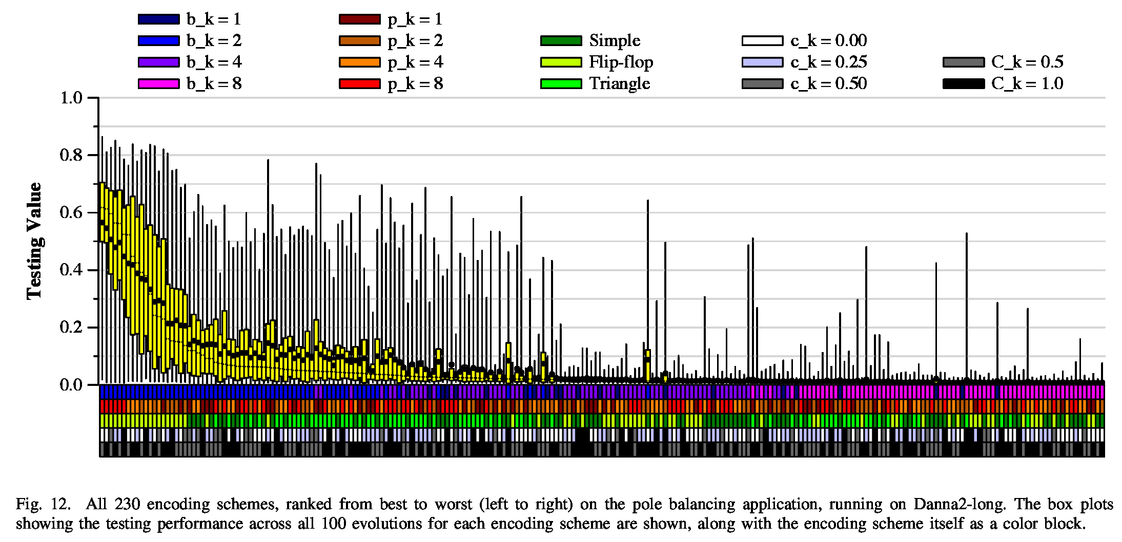 |
This was a challenge, because we have tukey plots for 230 different parameter settings, and we wanted to present it in a way that the reader might be able to draw some conclusions. The boxes along the bottom are pretty effective, I think. As with the Floyd example above, this read one input file, which was sorted by the median of the Tukey plot data.
 |
 |
Here's a youtube video of gameplay -- it's really simple, but surprisingly fun (at least for me): https://youtu.be/gx23dxPdpns.
 |
 |
 |
|
 |