Project 1 — 1D Cellular Automata
Simulator Source Code and Executable
CASimulator.java (source code)
CASimulator.class (executable)
This program was written in Java by a student who took the class in
Fall 2007. It automates the entire process of the table
walkthroughs, calculating and recording the parameter values, and
generating images of the CAs. In Fall 2009, a student modified the
program to make gathering the data and classifying the images
easier.
Running the program
To run the program, type the following at the command line:
java CASimulator X
where X is the number of experiments to run.
Note for 427/527 students: In order to compute the fifth
parameter, you may need to modify the given Java program. The
program has a place holder for this in the function calculateZeta().
The fifth parameter is declared as a variable of type double
named zeta. It is generally better to come up with a
new parameter that implements a different way of examining the
states and neighborhoods, rather than simply taking averages of the
given parameters.
Experiment records
The program will create an experiment record sheet in .csv format
for each walk-through (experiment). The experiment records for all
the experiments are included in one master .csv file called MasterExperiment.csv.
The 4 lambda and entropy values are automatically written to these
reports, as well as the zeta value for the 5th parameter. You will
need to fill in your name, the class for each step of each
walk-through, and an observation for each step of each walk-through.
You may also need to adjust the width of some of the columns. When
filling in the class for each step of each walk-through, enter "0"
for classes I and II, "1" for class IV, and "2" for class III. This
will facilitate making the graphs with the class numbers. When
filling in the observations column, the more steps that you include
an observation for, the better. Including observations for every
step (or nearly every step) may boost your grade slightly. You are
required to do at least 20 experiments. Doing more than 20 can earn
you a higher grade.
Images of CAs
The program will also generate a .jpg image for each step of each
walk-through. You will examine these images to fill in the rest of
the information in the record sheets, namely, the class and the
observation. Each experiment has a separate directory which includes
all the generated .jpg images for that experiment. Each of the
experiment directories are included in the master directory Experiments.
Also, the program will generate an .html web page for each
experiment which will show all .jpg images for that experiment side
by side to make viewing and classifying the images easier.
Classification of the CAs
A significant piece of this project is to view images and make a
classification based on what you observe. This can be somewhat
challenging since it is very subjective. The link below provides
several examples from each of the 4 classes to help guide you in
this process.
Classification of 1D Cellular Automata
Note that it is relatively rare to get class IV behavior, so don't
worry if you don't end up with very many instances of class IV.
Calculations
Compute the average and standard deviation of each of the 4
parameters (also the 5th parameter for 427/527 students) for each
instance among all walk-throughs that you classify as Class IV. Be
sure to state which of the 4 parameters appears to be the best
indicator of Class IV, and explain why. To get these
calculations, it is probably best to copy all of the Class IV
instances into another spreadsheet (or at the bottom after all the
experiments) so that they are all together. This will make it easier
to define the average and standard deviation formulas. For the
average, you can use the formula =average(begin:end)
and for the standard deviation, you can use the formula =stdev(begin:end),
where begin and end are the cells that
the data begins and ends at, respectively. For each parameter, the
begin and end column will be the same, and the row number will be
different. Use these formulas for each of the parameters.
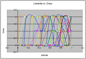
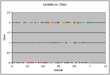
Graphs
Make a graph for each of the 4 parameters (427/527 students will
also make a graph for their 5th parameter). On the x axis is the
value of the parameter, and on the y axis is the classification. It
may help to include two versions of each graph: one that has all the
curves, and one that just has the points. Including 20 or more
curves on one graph can get a bit messy, so making an additional
graph with just points can be helpful. Here is an example of what
the graphs might look like for lambda (for 40 experiments):
These graphs were made using Excel. Below is an explanation for how
to create graphs like these for both 2003 and 2007 versions of
Excel. If you prefer, you can also use other graphing utilities,
such as GnuPlot or MatLab.
Excel 2003
To add a graph, choose "Chart" under the "Insert" menu. The "Chart
Type" window appears first. Choose "XY scatter plot", then the type
of scatter plot (points or curves) on the right. Then click the
"Next" button. The "Source Data" window appears next. Choose the
"Series" tab to define the plots. After clicking the "Add" button,
you can define the X and Y values for the series. The X values will
be the parameter value (e.g. lambda), and the Y values will be the
class number. To define these values, you can just go to the
corresponding column in the spreadsheet for the series (experiment)
you are on, and highlight the 13 rows in that column that have the
parameter values or class numbers. After you release the mouse
button, the formula will then appear in the box for the X values or
the Y values. Repeat this process for each of the 20 (or more)
experiments. You will have a series for each experiment. When you
have defined all of the series, click the "Next" button. The "Chart
Options" window appears next, and here you can include titles for
the chart and the X and Y axes. Choosing the "Finish" button will
insert the chart as you defined it into the spreadsheet. After the
chart is inserted, you can right click on it to change anything in
the "Chart Type", "Source Data", or "Chart Options" windows.
Excel 2007
First, click on a blank cell of the spreadsheet so that you will
start with a blank graph. Then from the "Insert" menu tab, choose
"Scatter" under "Charts", and then choose the type of chart you want
from the dropdown menu (points or curves). A blank chart will now
appear in the spreadsheet. Then click on "Select Data" from the
"Data" tab in the menu area. Here, you can add the series of plots.
You will have a series for each experiment. Click on the "Add"
button, and this will pop up a window where you can add the X and Y
values for the series. The X values will be the parameter value
(e.g. lambda), and the Y values will be the class number. To define
these values, you can just go to the corresponding column in the
spreadsheet for the series (experiment) you are on, and highlight
the 13 rows in that column that have the parameter values or class
numbers. After you release the mouse button, the formula will then
appear in the box for the X values or the Y values. When you have
entered formulas for both X and Y, the plot will appear in the
graph. Repeat this process for each of the 20 (or more) experiments.
To include labels for the chart and the axes, choose the "Layout"
tab under "Chart Tools" in the menu above. Use the options "Chart
Title" and "Axis Titles" in the "Labels" section in the menu to add
the labels.
Discussion
Discuss the correlations (if any) between the parameter values and
the class behavior. Indicate the general range of values associated
with Class IV behavior. Be sure to point out any anomalies and give
possible explanations for these anomalies. Note if you've
observed Class I or II behavior at high parameter values, or Class
IV or III behavior at low parameter values. The more discussion and
analysis that you do, the higher grade you can earn.
There is no required length of the report, and quality is generally
more important than quantity. As a general guide for this project, a
couple good sized paragraphs should be enough to satisfy the basic
requirements. Of course, you will likely need to include more
discussion than that to get a higher grade.
Submission
Submit the following items:
- Report (in .pdf format): This includes the 3 items
mentioned above: Calculations, graphs, and discussion/analysis.
- Experiment record sheets (in .csv, .xls, .xlsx): This
is the MasterExperiment.csv file generated by the program that
you fill in with the classification information.
Note: While it is a good idea to include a few images in your
report as part of your discussion, it is not necessary to submit all
your images that were generated. You will have over 200 images, and
this can result in large submission file sizes, so it's best not to
include them.
Submitting your work
Tar or zip your files together and submit them via Canvas. The directory
should include your report (in .pdf) and the .csv, .xls, or .xlsx
experiment sheet.
Grading:
Earning higher grades:
As with all the projects this semester, fulfilling the basic
requirements will earn you a B. To earn higher grades, you will need
to do further experimentation and/or further discussion/analysis.
For this project, if you do significantly more walk-throughs (eg. 30
or 40), that would boost your grade to a B+. If you also do well on
the report and include thorough analysis, that would boost your
grade to an A. If a 420 student does the 427/527 portion, that will
earn at least an extra half letter grade, possibly a full letter
grade.
Avoiding lower grades:
Your grade will lower from a B if you fail to perform some of the
required experiments and/or you do a poor job on the report. If you
did only 10 experiments (instead of 20), that would probably lower
your grade by half a letter grade. Not including a discussion would
probably drop your grade by a full letter grade. For example, if you
just did 20 experiments, but turned in no report, no graphs, and no
calculations, assuming you fulfilled the classification work for the
20 experiments, your grade would probably be a D. Avoid this by
doing and submitting all the required items!